- 7 min. reading time
Design Library Strategy: Taking off With Chakra UI
Contents
This article continues the story of our design library journey. In the last article, How We Didn't Build a Framework Agnostic Design Library, we talked about what we would not do, which is implementing a whole new design library from scratch.
Instead, we'll build upon a component library that's already there, namely Chakra UI. We'll take care of the framework agnosticism we wish for further down the road.
Because hey, how hard can that be?

But jokes aside, even if we cannot make our design library framework agnostic right away, there are things we can do right now to make things easier for future-us.
The goal is to take advantage of Chakra UI without marrying it.
So What Is This Chakra UI?
Chakra UI describes itself as a "simple, modular and accessible component library". We mostly agree with that - why only mostly, you'll see in the section Getting the Design Tokens Right.
Chakra UI comes with a default theme, a set of basic components you would expect to find in any design library, and comprehensive documentation with some nice, subtle references to anime culture.
We can overwrite all design tokens in the theme (e.g., colors, spacings, fonts, ...) with our own values. And because the components that come with Chakra UI use those design tokens, they are adapted automatically.
Buttons, form elements, and some must-have layout components are already included and they are accessible out of the box!
We can modify their look and feel either by overwriting the component-specific styles in the theme, which then applies to all instances of the component, or directly on a component's instance itself via its props (Style Props).
The names of style props are stolen from heavily inspired by Tailwind CSS. Chakra UI also includes the handy mechanism for defining responsive styles.
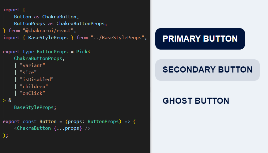
To bring semantic structure into component styles, it introduces the concept of variants, sizes, and color schemes. This allows us to define style derivatives like primary and secondary buttons with ease.
Most importantly, we can extend the library with custom components and style their respective parts with the same mechanisms as the built-in components. That means our Chakra UI-based library can grow as our projects grow.
So much for a quick overview, you can learn more about Chakra UI here:
- Chakra UI: First Steps
- Egghead Course: Build a Modern User Interface with Chakra UI
- Tech Hot Takes: Chakra UI Review
What Problems Does Chakra UI Solve for Us?
By now we said it at least three times. But to really drive it home, I'll say it again: Creating a design library is a massive undertaking. And you have to pay forward a big chunk of the work until you are rewarded for it.
More often than not, the design library has a supporting role in the scope of a larger project. So it makes sense to only implement components on an as-needed basis.
But in the beginning, every new screen design we encounter is packed with new components. And each component, however small and basic it may seem, must be implemented for reusability and thoroughly tested and documented. We also need to check the design for corner cases. And don't forget to verify the correct behavior of the component in different layouts...
Only then we can add the component to the design library with a sense of confidence that we'll indeed be able to reuse this as-is the next time. What may look like a cute little form in the beginning could keep us busy for weeks.
Chakra UI gives us a considerable head-start by providing us with the basics. This goes a lot further than only saving the time of implementing a few components! A lot of groundwork is done for us as well because Chakra UI also provides us with mechanisms for a global theme, responsiveness, and dark/light mode.
With these things already ticked off our to-do list, we can spend some of the time we won doing fun things, e.g., doing more exploration work. Because in the beginning, we want to try many different design ideas until we find something that clicks.
Hiding a Nine-Tailed Demon Fox in the Closet
Of course, there is also a trade-off involved in using Chakra UI. As we buy into this framework and implement more components based on its principles, we bind ourselves to it.
We wouldn't use it at all if we weren't convinced of the benefits it brings us. But we still don't want to go as far as exposing Chakra UI specifics in our design library API indiscriminately. Because in case you forgot: our endgame is still to make our design library framework agnostic!
So here are some measures we take to ensure that Chakra UI stays our dirty little secret.
Getting the Design Tokens Right
In Chakra UI, the design tokens specified in the theme (also called theme tokens) determine acceptable values for the style props of all components. That means having wrong design tokens not only makes things look different than intended. It also leads to wrong component interfaces because they offer these invalid tokens to the library's consumers.
In with the new
Our first step is to adapt the theme to only contain the design tokens we need. For instance, the default theme specifies ten different tokens for the shadows theme field, which is applied to the textShadow, shadow, and boxShadow props of components (see the Shadow Style Props Documentation).
Customizing the theme tokens is done with the extendTheme() function.
But what if our design system only has three shadow design tokens instead of ten? The documentation says we can overwrite or extend the theme tokens with this function. That's not the same thing as replacing, we still have to throw out the unnecessary tokens for our theme to be correct.
Out with the Old
This can also be achieved with the extendTheme() function, but we'll have to coerce it a little. Let's take a look at the inner workings of this function. We learn that it takes an array of (partial) themes to override the default theme with. And if the last argument satisfies isChakraTheme(), it will use that as the new default theme. It still expects at least one argument of overrides though.
So we can do this:
import { theme as chakraTheme, extendTheme } from "@chakra-ui/react";
import { shadows } from "./foundations"; // our shadow design tokens
import { components } from "./components"; // our custom component styles

const config: ThemeConfig = {
    initialColorMode: "dark",
    useSystemColorMode: false,
};

const overrides = {
    config,
    components,
}

const baseTheme = {
    ...chakraTheme,
    shadows, // replace chakraTheme.shadows
}

export const theme = extendTheme(overrides, baseTheme);
Basically, we can use two different ways of adding tokens to the theme:
- by adding something to the
baseThemeobject, we discard the tokens ofchakraTheme. - by adding something to
overrides, we merge our tokens into existing tokens that may be there. Values that are not overwritten will stay in the theme.
The extendTheme() function comes with this disclaimer:
NOTE: This got too complex to manage, and it's not worth the extra complexity.
We'll re-evaluate this API in the future releases.
so the community is aware that this function is a bit wonky to use.
We expect that it soon may be reworked, and will post an update if our approach changes subsequently. At the time of writing this post, we are using @chakra-ui/react@1.7.3.
In the long run, we will probably throw out most of the chakraTheme defaults. But as our designers have not fully specified all of our design tokens yet, we will adapt them bit by bit as our design system becomes more defined.
From Token to Types
We have successfully cleaned up the theme to include only the design tokens we care about. Now we can generate new TypeScript theme typings with the chakra-CLI script. Chakra UI documents how to use it in their documentation on theme typings.
For our IDE's IntelliSense to recognize the types correctly, we placed the generated type file directly in the node_modules folder. With this, we get auto-suggestions with our updated design tokens when we set a style prop for a component.
Trimming Component APIs
Chakra UI decorates its component with Style Props. The StyleProps contain lots of props relating to styles (duh!), so consumers can easily tweak the component's CSS, e.g., by adding a margin or changing the color:
<Button
    margin="2px"
    color="red"
>
    Click me!
</Button>;
That's pretty neat, but we don't want to adapt these component props directly for our design library. Why? While this is very convenient for trying stuff out, it also results in the Chakra UI <Button /> component having 661 props. Our design library consumers probably won't use at least half of them.
But if they are in our interfaces, we would have to re-implement all of them if we were to throw Chakra UI out one day. Otherwise, we would be breaking interfaces left and right.
Aside from that, some of these style props are even harmful to the consistency of our design library. They allow the library's consumers to change style properties that should not be changed. Having a button with the color pink is not intended by design. So why make it possible in the first place? We decided to hide these superfluous props by re-exporting the components and restricting their interfaces using TypeScript:
import { ButtonProps as ChakraButtonProps, Button as ChakraButton } from "@chakra-ui/react"

// I said interface but used type, sue me
export type ButtonProps = Pick<ChakraButtonProps, "onClick" | "children" | "margin">;

export const Button = (props: ButtonProps) => <ChakraButton {...props} />;
There, all tidied up! This way we can also extend the Chakra UI components with additional properties and logic, further customizing them.
After doing this for a handful of components, we noticed that there is a set of style props we usually do want our components to have. For example, margin and its variants marginLeft, marginRight, etc. are necessary to position our components in a layout.
So we collected these common style props in a BaseStyleProps type. Now we can simply add it to all component interfaces for a consistent user experience for our library consumers.
Conclusion
Chakra UI is a game changer for the early stages of design library development.
It includes mechanisms, features, and components that are crucial for every design library. We can take off immediately while keeping its interfaces open enough for us to make it look juuust right.
By encapsulating it and kicking out everything (read: design tokens and component props) we don't want, we hide Chakra UI from the library's consumers and make it harder to use the components in an unintended way.
That's how we start our design library journey at Volocopter.
Have you tried out Chakra UI before? How did you like it?
Or do you want to point out how wrong we are about something in this article?
Let us know on twitter or LinkedIn!
References
| ↑1 | Photo by Mitchell Luo on Unsplash |
|---|