- 6 min. reading time
How We Didn’t Build a Framework Agnostic Design Library
Contents

You probably know the drill. But don't worry, we've all experienced it at some point. Dealing with CSS properties on complex, single-page applications can be super painful.
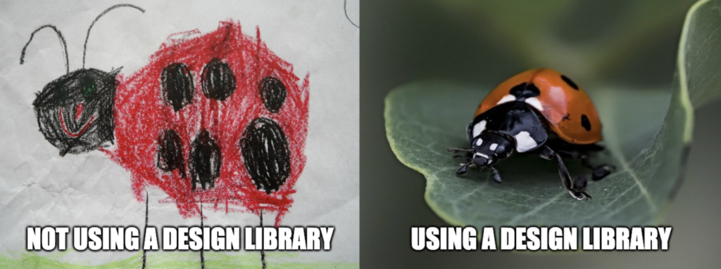
Design libraries alleviate much of that pain for us as they deliver coherent and uniform building blocks for user interfaces.
Their usage is imperative for any web application that claims to scale well. For example, design libraries allow teams to efficiently deploy new features without worrying too much about their components' consistent style.
But if your organization intends to employ more than one frontend framework (e.g., React and Vue), it's genuinely arduous to reimplement the design library for each one.
A conceivably better approach would be to build the design library in an agnostic way so that it can be consumed by any framework. This blog post sheds light on how this can be implemented and why we decided against it - for now.
What's Our Goal Anyway?
Late last year, we were tasked with getting our Urban Air Mobility platform VoloIQ ready for production.
So far, this was developed as a prototype for about a year, successfully demonstrating its business case and the value it generates.
But now, we are striving for greater heights and want to build a stable, visually appealing, and scalable application, which will soon be used by the first customers.
For the frontend, this means that we have to develop our UI in accordance with the design specifications, completely accessible, and time-efficient.
One shortcoming of the previous prototype was the lack of clear design guidelines and a resulting inconsistency across the entire UI.
So this time, we want to take a structured approach right from the beginning by employing our own design library for the production-ready version.
Thus, we ensure that the implemented components' designs do not diverge across teams over time.
For those who have not yet come into contact with it: A design library is, simply put, a collection of generic UI components such as buttons, text fields, or modals that are uniformly styled and can be easily used to build web pages and applications.
But before we start with how we build one for ourselves, let's briefly dig in and shed some light on the frontend technologies VoloIQ is utilizing.
React was used as the framework of choice for the prototype, and we also plan to use it for the upcoming version of the VoloIQ platform.
Are You Tired Writing Your Frontend Using React?
No? Neither are we! React is awesome; we use it for every frontend project.
However, we do not want to commit ourselves now that this will be the case for the entire lifetime of VoloIQ.
The modular microservice architecture allows our application to render modules written in different frameworks.
With the number of development teams at Volocopter growing and the constantly evolving JavaScript ecosystem, it's quite conceivable that we will also want to write modules in a framework other than React.
In short, this means that we probably will give our future selves a hard time by having a design library that can only be consumed by projects using React.
Therefore, we looked at how we could build our design library in a framework-agnostic manner.
One technology that has been gaining momentum in recent years is Web Components.
They bring many benefits of React - that is, easy to build composable and reusable components - and are supported natively in all modern browsers.
Web Components are not yet another Javascript framework but a set of web platform APIs that can be used to create components in HTML.
Any frontend framework working with HTML can handle them, which also applies to React.
So we could build our design library with Web Components and consume it in projects created with React, Vue, Svelte, or whatever the community comes up with next.
It's That Simple, So Let's Build a Design Library Based on Web Components!
But hey, hold on a second. Build your own design library from scratch? Doesn't that take forever? I once wrote just a single custom select box, and it took months.
You're right. It probably looks a lot easier at first glance than it really is. Accessibility, responsiveness, light and dark mode support, ... (the list goes on)
These are all things to consider when building a design library, and they take a lot of time.
In fact, there are even companies that specialize solely in implementing design libraries!
However, we were only a handful of frontend developers at the time and the feature backlog for the coming months had it all.
That meant - putting aside our enthusiasm to write a brand new design library from scratch using Web Components - we had to face reality and accept that we didn't have the capacity to do so.
So what other options are there?
Open Source for the Win?
With high hopes, we set out in search of an existing design library that's built on Web Components and allows us to customize it the way we need.
But design libraries are highly opinionated by definition.
So, of course, there is no off-the-shelf solution that fits our design specifications and reflects Volocopter's corporate identity.
Luckily, most design libraries offer the possibility to customize individual design tokens (e.g., color palettes, font types, or spacing).
Some of them already draw the line here, and it is challenging to customize further aspects of the library, while others give you more freedom.
So we looked at all the open-sourced design and component libraries based on Web Components and evaluated them for their customizability, maturity, documentation, and ease of use.
We quickly discovered that, by December 2021, none of these open source projects had more than 7000 stars on Github or more than 20000 weekly downloads on NPM.
These are astounding numbers in absolute terms, but compared to some of the more extensive component libraries for React, these numbers are relatively insignificant.
This first impression was confirmed after a closer look at the individual projects. None was convincing in every aspect (see appendix).
While most of the libraries are backed by large companies, the number of consumers is relatively tiny, and it's questionable whether any of these libraries will still be around five years from now (or at least still be maintained).
With this realization, implementing a Web Component-based design library using an open-source solution is off the table - the options now simply contain too many uncertainties for too little benefit.
Looking at the lack of open source solutions, we can't think of another way than actually writing the design library ourselves.
Buying Ourselves Some Time
Postponing our ambitious dreams in favor of a pragmatic solution, we decided to start implementing our design library with the help of an already seasoned React library and figure out a way to turn these components into Web Components later.
And this swap should happen without changing the component's API so that the design library consumers don't even notice we switched the React components with React wrappers of Web Components - it's truly magical.

That would give us all the advantages you can expect from a React open-source library - that is, to start feature development in parallel with the development of the design library.
After all, the components already exist, their design is easy to adapt, and they can be used from day one.
Bottom Line
To conclude, Web Components are a superior technology for design libraries as they allow you to build generic components once and use them in any framework.
Unfortunately, not much in the open source community makes it easier to build such a library, and doing it yourself from scratch is a crazy amount of work.
Chakra UI is a terrific way to bring a custom design library to life in no time.
However, the resulting design library will only support React consumers and cannot be shared across projects using different frontend frameworks.
Therefore, we started with Chakra to get us going quickly and will gradually move to a Web Component-based version of our design library.
Appendix: Overview of the Most Prevalent Web Component-Based Frameworks
Carbon Design System
Backed by Company: IBM
GitHub Stars: 270
NPM Weekly Downloads: 2,150
Pros: -
Cons:
- Very limited customizability options (only color tokens)
Material Design
Backed by Company: Google
GitHub Stars: 2,900
NPM Weekly Downloads: 20,000
Pros:
- Also provides components for mobile
Cons:
- No stable version released yet
- Documentation is extensive but not straight forward
Bolt Design System
Backed by Company: Pega
GitHub Stars: 228
NPM Weekly Downloads: 5,200
Pros: -
Cons:
- Uses Twig templating
- Poorly documented
Clarity Design System
Backed by Company: vmware
GitHub Stars: 6,400
NPM Weekly Downloads: 4,992
Pros:
- Provides wrappers for common frameworks
- Very well documented
- Comes with Figma project
- Customizable theme
Cons: -
Fast Design
Backed by Company: Microsoft
GitHub Stars: 6,500
NPM Weekly Downloads: 3,592
Pros:
- Provides wrappers for common frameworks
- Very well documented
- Light/dark mode support
- Fully customizable
- Good usage examples with Fluent UI
Cons:
- Very sophisticated, not trivial to use
- Steep learning curve
Spectrum Web Components
Backed by Company: Adobe
GitHub Stars: 514
NPM Weekly Downloads: 485
Pros: -
Cons:
- No stable version released yet
Numl
Backed by Company: -
GitHub Stars: 294
NPM Weekly Downloads: 18
Pros:
- Concept is similar to Chakra UI
Cons:
- Not very mature
- Introduces custom concepts for styling
Shoelace
Backed by Company: -
GitHub Stars: 5,900
NPM Weekly Downloads: 4,443
Pros:
- Provides wrappers for common frameworks
- Fully customizable with CSS
- Very well documented
Cons:
- Is mainly developed and maintained by a single guy
References
| ↑1 | Photo by Robin Higgins on pixabay |
|---|---|
| ↑2 | Photo by M. W. on pixabay |
| ↑3 | Photo by Fabio Grandis on pixabay |
| ↑4 | Photo by Khashayar Kouchpeydeh on Unsplash |